JAMESONS
2025
Spirits & Alcohol
SPIRIT
Evolve. Elevate. Unite.
Redesigning the world’s best-selling Irish whiskey
Jameson has always been more than whiskey. It’s a legend in a bottle, with a story passed down through generations. While Jameson Original is beloved worldwide, it was time for the brand’s wider portfolio of high-quality crafted whiskies to step into the spotlight.
We were tasked with bringing the whole family together, giving the portfolio a bold, unified look, boosting its premium presence on the shelf, and doing it all without losing the playful personality that makes Jameson “the serious whiskey that does not take itself too seriously.”

Iconic Irish Spirit
Redesigning a brand as iconic as Jameson takes respect and care. It’s not about reinvention, but reimagination. Our strategy took the elements everyone knows and loves and turned up the volume, giving them sharper focus, greater craft, and stronger meaning across the range.
The Jameson crest was re-sculpted to stand taller and prouder on pack, while the wordmark gained a playful twist, most notably in the serifs and the crossbar of the ‘A’. The taller cap height gives the logo added presence and makes it really stand out.
Every detail now feels bolder, prouder, and more expressive - rooted in heritage yet looking confidently to the future.


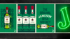
One Big Premium Family
We brought clarity to the portfolio with refined typography, harmonised colour palette, and a clear label hierarchy. Each expression now stands on its own while feeling unmistakably part of the Jameson family.
Subtle foils, premium materials, and tactile finishes add sophistication without losing that approachable charm. Slip labels now spell out the differences across the portfolio, guiding fans and newcomers alike.
Storytelling is stitched into every pack, celebrating craft and authenticity, with a dash of Irish character.
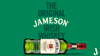
Stand Tall, Stand Proud
The new structure of the Proud Bottle, used for Jameson Original, is a modern twist on Jameson’s classic green glass. Sculpted shoulders, simplified embossing, and an elevated wordmark give it shelf presence that demands attention. Confident and contemporary, it carries the unmistakable Irish character Jameson is known for.


Where Belief meets Spirit
The redesign turns Jameson’s approachable charm into a premium experience while staying true to its heritage. The new portfolio structure invites loyal fans to explore and trade up, while welcoming newcomers into a world that feels both familiar and freshly exciting.
Striking the perfect balance of credibility and playfulness, with that sly Irish wink that makes Jameson unmistakable, every detail of the redesign creates belief in the brand’s promise to make everyone feel welcome in a community where spirit is shared, connections are celebrates and we are stronger together.
Related project

Related project